In this image you can see a couple hugging and a sentence that sais :
''There are reasons to believe in a better world''.
TV's commercial
The commercial deals with a group of children and a man , they all are in a room , all of them are sitting except for the man. He has a guitar.
The start singing the song ''Whatever'' and the man also plays the guitar.
In this commercial the want to explain that there are reasons to believe in a better world so they include images and sentences that talk about what is the world like nowadays.
Differences:
In my opinion I think it's better the TV advert because it tells you more information , it's more complet , funnier and also more original but the magazine commercial is also well done.
In this picture we can see how a young girl enjoys drinking coffee. She´s in her house and as usual she is having breakfast Nescafé. In the image appears the slogan, "celebra los buenos momentos" that means, "it celebrates the good times".
TV commercial:
This commercial deals with celebrate the good moments, like: peace, the "good morning", the moon...
Here we can see different moments around a day in which the characters feast the twenty-four hours of a day.
Differences:
I preferthe tv's commercial, becuase I think that is more interesting and funnier. In the newspaper's advert has a little information so you can choose to buy it or not. While if you see the tv's commercial you are sure to buy it.
Andrea Muñiz Nicolás 3ºC
Magazine´s advert
In this image we can see a winged AXE jar. It is pink and it has lke an angel´s circle over it. The background is black and under the jar we can read: New axe excite, even the angels will fall.
TV´s advert
This advert trancurs in an Italian village. suddenly some angels start to fall from the sky, all people is astonished, finally the angels meet a boy and the scene changes showing us the boy using AXE
Differences
The biggest difference between them is obviously that the TV´s advert has movement it is much more impressive than the magazine´s advert. Another difference is that the Tv´s advert has been designed more carefully making it better than the other.
I like both designs but I prefer the Tv´s advert because of the emotion that caused on me when I saw it. I also prefer it because it is longer and shows us a typical italian village and the angels are really well-done.
The comercial I'm going to talk about deals with Heineken. Heineken is a beer brand created in Holland in 1887.
This comercial starts in the house of a girl. She shows to the other three girls all the house, and then, she shows them a wardrobe full of expensive clothes. So all the girls start shouting. But suddenly, they heard a sound, so they went to see what happened. They saw the boys in a huge fridge full of Heineken beer.
In the image, we can see a bottle with a green background. The slogan of this image says:"Resistance is futile, (and completely unnecessary)
The main difference of this two types os advert, is that the image have a big impact on you the first time yo see it. And the video is very funny and interesting, and you can see it more than once and it can make you laugh. The image is more aggressive and the video is more relaxed.
This picture is called "Des glaneuses" (the gleaners). It was painted by Millet, and it was finished in 1857. It's a realistic picture of three peasant gleaners picking up stray grains of wheat after the harvest in the outskirts of a rural old french city.
The painter used yellow as main colour, the picture is mostly painted in different tones of it : The landscape, the hat of the third woman, the sky is painted with some yellow too...
This picture represents the hard-work the rural people of the low end of the social system have always had to do to survive and get something to eat, that's the reason why this painting is famous.
I've chosen this picture because I really like the colours Millet used and it's an impressive picture, because it represents in a great way the poor rural people's conditions in live, you can see it on their clothes. I like the way Millet represents the depth, the trees really look like they're far away. I also think that the position in which the gleaners are awesome, because it's a very realistic way to express how the gleaners are bent down to get the grains.
Wednesday, December 12, 2012
Dots
This is a portrait of John Lennon drawn with dots.
This
picture is made by Michael Fridjhon in 2004
Lines
This
picture is made by Abdullah Zaid with Shadow Lines.
El Grito is the famous picture, which
is made by Edvard Munch.
The picture reflects angst the person.
Shapes
This
portrait a woman with many circle and square by Pablo Picasso.
This
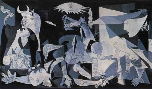
picture is called Girnica by Pablo Picasso.
Textures
The texture drawn with different
materials: skins, fabrics …
In this image we can see a blond girl who is wearing a cute pink dress. She's catching a different apple from the ones that are on the ground. This different apple is the perfume called Nina L'Elixir by Nina Ricci. Under these data it appears the slogan which is "Le noveau parfum magique" (the new magic perfume).
TV Commercial:
This commercial begins with a girl who is in her bedroom. She starts walking and she enters in a sort of a magic forest, in which she tries to catch a unique apple from a tree but she can't because this apple starts to fly trough the forest. So the girl tries to chase it and at the end of the commercial she achieves it.
Differences:
I really think that the advert on the TV is so much better, because it tells you the story from this girl and what happens to her. While the advert on the newspaper it just tells you the end. Also the magic that these perfume pretends to show is better reflected on the commercial. The position of the brand is the same in both, because the newspaper's one is the last image from the commercial. Anyway I think that the slogan should be bigger.
This is an example of dots, is a landscape, this style is called Pointillism.
SHAPES: This is a good example of shapes, is an abstract painting, made of squares, lines and circles.
TEXTURES:
This is an example of textures,in one of the pictures you can see that is a rough texture and in the other picture is smooth.
LINES: This is an example of lines,in one of the pictures you can see many lines horizontally and vertically, in the image of the landscape are curved lines this painting is called "El Paisaje" by Van Gogh.
BY LAURA PEDREAÑEZ 1ºC.
Self-portrait by Diego Meana.
THE PERSISTENCE OF MEMORY.
In 1931, Dalí painted one
of his most famous works,The Persistence of Memory,which introduced a surrealistic image
of soft, meltingpocket watches. The
general interpretation of the work is that the soft watches are a rejection of
the assumption that time is rigid ordeterministic. This idea is supported by other images in the work, such
as the wide expanding landscape, and other limp watches shown being devoured by
ants.
She's situated in the middle of the forest that has lamps hung up on the trees' limbs and she's wearing a gorgeous and voluminous pink dress. Her face expression tells us that she's fascinated by everything that's there. Then it just appears the fragrance container and under it the name of it, "Wonderstruck", the creator's name, Taylor Swift, and at last it appears the slogan: "The beginning of something magical."
TV's commercial:
Description of chapter one:
On the first chapter of the TV commercial, we can see how she walks towards a mirror and then she scents herself with her own perfume called "Wonderstruck" which means to be overcome by awe or wonder. The second right after that, the mirror starts lighting up and when she touches it, she is suddenly in the middle of a forest that has a lot of lamps that are hung up on the trees' limbs. She looks around and all of the sudden, when she turns around, she sees a boy looking at her. Afterwards, she just keeps exploring that place until she finds a door and she opens it and a message saying "to be continued..." appears.
Description of chapter two:
At the beginning of this one happens the same thing that happens with chapter one's beginning, but instead of appearing in the middle of the forest, she walks into a room that has a mary-go-round situated in the middle. After that, the boy that she saw before appears again standing behind her, but he leaves the room and disappears. Then she sees a big mirror and walks towards it and when she touches it, it lights up as the previous one did. Finally, it says again "to be continued...", so I guess we'll have to wait for the third one to see what happens.
Comparison:
I think that both adverts are very well done because even though in the magazine advert we don't see any story, just the image, it gives us the feeling of thinking that we're living a fairy tale when we have that fragrance on. But I think that TV commercials always give us more information and this one does that because it shows us a story and it also tries to tell us that this perfume is going to make us live that story and be a princess. The magazine advert also gives us that impressions, it's just that the TV commercial exemplifies them better.
When you see this commercial on TV, it gives you the message of not having a head full of dandruff, it also shows the girl washing her hair and an image where the head is full of dandruff particles until a kind of wave comes and sweeps over the head and all the pieces of dandruff fade out. You can also notice that using that shampoo your hair is going to be gorgeous all the time and smelling very good.
In the newspaper's advert you can only see the shampoo and guess that it's going to make a good effect on you, but you don't have any proof of that. I think that the TV commercial has a lot more information because it shows different results that you're going to obtain if you use this product. But there's one thing that the TV commercial doesn't say and it's that it is for oily hair types and the newspaper's advert does, because in the image of the shampoo it says "For oily hair". The image of the shampoo also appears on the TV commercial but it isn't as noticeable.
In my opinion the best is the one that appears on TV just because it gives you more information and it captures more your attention.
In this image we can see the car with a really colourful background in red and white. On the foreground we can see the car and and an iPad. Renault's logo appears in the left corner on a really creative way.
Complete TV commercial:
The commercial is telling us that we won't ever forget the first time that we've seen this car. And during the whole commercial we will be listening to different people talking about their experience when they saw it.
In the end, they show us the car and a man voice-over sais: "You will always remember the first time you saw it".
Differences:
We can clearly see the differences among both commercials. In the newspaper's one, they just show you the product, but in the TV commercial, they don't tell us what they're talking about until more than a half of it. It also should be pointed out that in the TV commercial, there are dialogs between different actors, what doesn't happen in the newspaper's one.
I like the most the TV one, because it is really creative, actors don't overact, and the soundtrack is gorgeous.
Francisco Fernández López
Snakes
Description
Venomous
snakes use modified saliva, usually delivered through highly
specialized teeth, such as hollow fangs, for the purpose of prey
immobilization and self-defense. In contrast, nonvenomous species
either their prey, or overpower it with their jaws.
Lists or rankings of
the world's "most venomous snakes" are tentative and differ
greatly due to numerous factors.
Sometimes,
toxicity of snakes is used to determine their danger to humans but
this is improper. There are far more factors critical to determine
the potential hazard of a snake to humans, including the distribution
and behaviour of the species.
Over 600 species are
known to be venomous—about a quarter of all snake species. BY: Ivan Martínez and Diego Meana.
Bruno Amadio, a painter who was more in the sarrow that in the glory and who has atributed a black and dark leyend, has created one collection that someone says it's damn.
The painter
There isn't so much things of this character and the information that we can find are are very confused. Amadio was born at the begin of the last century in Venice, was conservative and fascist and, of course, a faithful follower of Mussolini. He has participated in the World War II and was in it where he began to paint thedamn pictures, the series was called "Crybabies".
In these pictures, Giovanni Bragolin, because with this name signed his work, tries to show the horror of war in the tears of those unfortunate children and orphans, graphic symbol that the misfortunes that left the war wherever he went.
History tells us that Bruno Amadio painted a total of 27 paintings in this series and that all children living in orphanages and charity homes.
After the war, Amadio moved to live in Spain, first to Seville, where he spent several years of his life and then to Madrid, where we completely lost him trail.
The black legend
.Like his life, the legend has also an uncertain origin. According to the extended version, Bruno Amadio, wearing of being a second category painter, made a pact with the devil in order to have fame and the acknowledgment he deserved. (It is not known at what price). The thing is that, his paintings became very popular mid-century and were a very high precious. More than one will recognise the faces of these children wich it's picture, at least a copy, of our grandmothers in her walls. Somewhere a fire must have occurred in which the only thing that was saved was the crybaby picture and this is where the legend was triggered we know today. The houses where one of these original are put burn in flames and appears a source of mysterious and strange phenomena poltergueist.
This is probably the more famous picture, because, when you turn, you can see a 'fish' eaten a kid.
I specially like the mysterius history and the strange expression of the kids. BY: Jordán Donaire Gil
Carlota Serrano Rodero 1ºB-Eso
Graffitis
Graffiti is writting or drawing on a wall or other surface in a public place.
This picture is of George Seurat. ''The Seine and la Grande Jatte'' - Springtime 1888, Royal Museums of Fine Arts of Belgium. This picture is made up only with dots.
''The Suburbs'', 1882–1883, Museum of Modern Art, Troyes, of George Seurat.
LINES
'' The colors of the night'' . This picture is of Vicent van Gogh (1853-1890), in Amsterdam.Only with lines.
'' Thegirls of the bridge'' is of Edvard Munch (1901) is a classical picture. Is made up only with lines.
SHAPES ''Guernica'' of Pablo Picasso, is represented by different cultural expressions through literature, music, or visual arts.
This picture is of Emilio Pettoruti '' Quinteto'' (1927)


.jpg)
.jpg)


.jpg)




.jpg)