
The first logo were 5 years. This first logo had 3 different versions: 1.0 - 2.0 and 2.03. The logo were formed by 4 asimetric parts. The drawing were blue.
The second logo were very different, compared with the first. This try to send an idea of speed and dynamism. We can see 5 different colours: red, blue, yellow, green and black. This logo were designed in 1990, but in 1995, they company, changed.

In august 1995, Windows changed a little the logo. The included a sky, and they put Microsoft in white color, and they also included the year in which they designed the logo: 1995.

Three years later, Windows change the logo. Only a little. All the letters that were in the picture were black. The only detail is that they include the name of Microsoft.
When we went in to 21th century, Windows change another time the logo. This were more revolutionary. They put the logo in a window, with some other windows near them. Finally, they continue with same things: All the letters in black, with year. But the name of Microsoft disappear, like the sky.
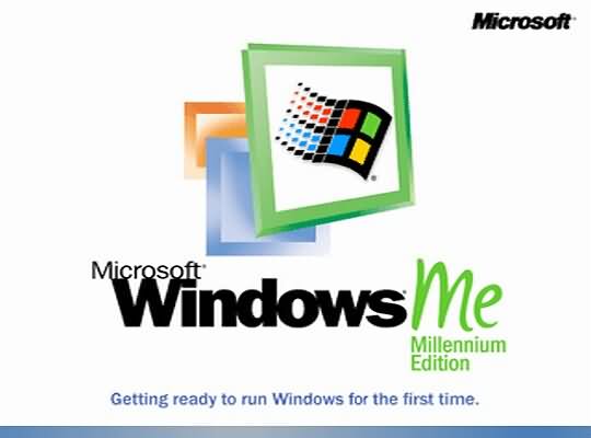
The company also did an special edition.

One year later, Windows produce a new logo, which I think is the most beatiful. The include 3D images and the word "XP" which cames fro the complete word, eXPerience.
The next logo were called "Windows Vista" and they had two different pictures. The first, doesn´t have so much changes. They only have changes in second word: isn't bold. The second only have the pictu, not the words.

With the problems of Windows Vista, Microsoft put in the shops Windows 7. The only change are the words, the other things, are the same.

And the last of the Windows logos. Microsoft 8. They remember to the first. The blue is the predominant colour, and the letters in white colour.
Well done, Bruno! a very interesting post about one of the most iconic brands of our times. Thank you very much for your effort.
ReplyDeleteThis comment has been removed by the author.
ReplyDeleteI find this post really interesting, my father has always been working with windows and he teaches me a lot, but he has never told me about the origins of the logo.
ReplyDeleteThank you for the post.
Fran, when a designer starts a project, the original drawing before, he /she has to look for information about the meanings of the image. Every picture saves a hidden meaning, there are a lot of very interesting books that talk about it.
DeleteIf you like, I can borrow some of them, you´ll enjoy it, sure!
Your welcom.
ReplyDeleteOh, my God, Bruno, YOU ARE WELCOME! Pay attention to spelling. You´re in 3rd. level of Bilingual Project! If you´ve problems or doubts, check with ortographic corrector of Word.
Delete