Tuesday, December 11, 2012

DOTS,LINES,SHAPES,TEXTURES


                                  DOTS


                                      The Circus 1890-91 Georges Seurat


                    Harbour at Marseilles, c.1906 Paul Signac


                               SHAPES

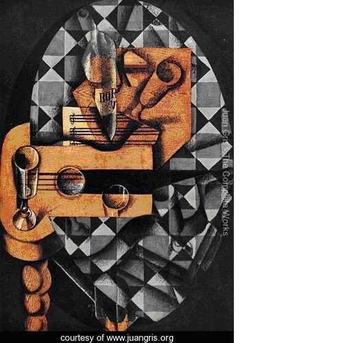
                      Guitar, Glasses and Bottle Juan Gris


                              Houses at  L’Estaque - 1908


                                                LINES

                      Miraculous landing 1920 Paul Klee

   
                          CAT AND  BIRD  PAUL KLEE


                                                   TEXTURES
                                                             
                   Blue Poles  1952  JANCKSON POLLOCK

                    CONVERGENCE  JACKSON POLLOCK


                                                 By Enrique Buznego Puerto 1ºC

Monday, December 10, 2012

The Starry Night


The Starry Night is a painting by the Dutch post-impressionist artist Vincent van Gogh. The painting depicts the view outside his sanitarium room window at Saint-Rémy-de-Provence (located in southern France) at night, although it was painted from memory during the day. It has been in the permanent collection of the Museum of Modern Art in New York City, part of the Lillie P. Bliss Bequest, since 1941. One of Van Gogh's most popular pieces, the painting is widely hailed as his magnum opus.
  
The center part shows the village of Saint-Rémy under a swirling and light sky during a night. On the right, you can see the Alpilles Mountains. A huge cypress tree was added to the left into the composition.
Of note is the fact van Gogh had already, during his time in Arles, repositioned Ursa Major from the north to the south in his painting Starry Night over the Rhone.

I think that Van Gogh wanted to reflect his state of mind. It's a simple but a beautiful picture.


By: Sara Treviño 3ºC
This is reflected in the dusk of a people.

                                                                            Although this is a reflection of the city and the bridge
 
                                This image is made with curved lines


The Birth of Venus by Sandro Botticelli

Artist: Sandro Botticelli (1445-1510)
Medium: Tempera on canvas
Genre: Allegorical history painting
Movement: Early Renaissance
Location: Uffizi Gallery, Florence.

The Birth of Venus (1484-86) remains one of the profound treasures of the early Renaissance. The work, painted with tempera on canvas, depicts the female nude figure of the goddess Venus standing on dry land having emerged from the sea. It was commissioned by Lorenzo the Magnificent (1449-92) of the Medici Family, whose humanist quattrocento circle was particularly interested in classical mythology, and marks the culmination of the revival of ancient myths, within the context of a humanistic Renaissance art.

Venus represents the ideal Renaissance woman: thin, pale, and curvy. Botticelli exaggerates the lengths of her neck and leg in order to bring the viewer’s attention to her beautiful features, which almost seem too perfect to exist. In fact, based on the woman’s stance and position at the very tip of the shell, it is actually impossible for her to be standing upright (Birth of Venus).

Botticelli has picked out highlights in her hair with gold leaf and has emphasized the femininity of her body (long neck, curviness). The brilliant light and soothing colors, the luxurious garden, the gorgeous draperies of the nymph, and the roses floating around the beautiful nude all suggest that the painting is meant to bring pleasure to the viewer.


 By Sara Alonso 3ºB

"La persistencia de la Memoria" by Salvador Dali

      The picture I'm going to talk about is called "La persistencia de la Memoria". The picture was painted by Salvador Dali in 1931. This picture is painted in oil on canvas.
      It's a picture very abstract. In the foreground we can see 4 clocks that looks that they are smelted. One of them is on a little tree and the other is on a abstract object that I don't know what it is.
It's very darkness at the front, but in the background we can see that it's brightness. Also there is a mountain and a piece of iron; Between them there is some fog. The sky is blue with some clouds.
      I like this picture because Dali painted that with a very abstract point of view, that reflects his ideas in a singular mode.


LINES

A line is a continuous succession of plotted points, such as a stroke or a script. The lines are often used in artistic composition, instead called "stripe" a loose straight lines, which do not form a particular shape or form.


SHAPES

The shapes in the pictures is the way to see many pictures in just one.


DOTS

Pointillism is a style of painting that is to draw a picture using points.


.


TEXTURES

They are external properties possessed by materials, objects, causing impressions of the senses dare either touch or visual, using different construction techniques which can produce prints, which are sometimes described as the ability to feel tactile sensations .


"El Caballero de la Mano en el Pecho"

The picture that I'm going to analyze is:"El Caballero de la Mano en el Pecho".
This picture was painted by the Greco around 1578 or 1580, his first spanish age.This picture is painted in oil on canvas.
This picture is made up of dark colours, where the bright part of the picture is the hand of the man and his face, and specially the parts in the neck and in the wristle which antecedent the others parts.
In this picture whe can see that the hand is huge compared to the rest of te body, and also that the face of the man is very large and also the neck.
When the Greco painted this pictured he do it to look like he was doing a deal with the person who looks at him.
I really like this picture because the important parts like the face or the hand of the man are in contrast with the wall, the hand and the face are bright and it contrast with the wall. Also because is a very misterious picture, I mean, anybody knows who was him.

Elena Arias Quirós 1º A lines, textures, dots and shapes.


LINES

These two pictures are made with lines. Whit different types of lines you can create beautiful images.

                            
SHAPES


If you paint a picture with different shapes you are do ing an abstract drawing.

      
DOTS


The art of the points is called pointillism, trying to put together scoring points for the figures are clear.
   
SHAPES
If you paint a picture with different shapes you are do ing an abstract drawing.


BY ELENA ARIAS QUIRÓS 1ºA

Sunday, December 9, 2012


"LAS MENINAS"  BY VELÁZQUEZ


The picture that I’m going to analyze is: “Las meninas”.

This picture has been painted using the oleo technique in 1656 by Diego Velázquez, the leading artist of the Spanish Golden Age. The work's complex and enigmatic composition raises about reality and illusion and creates an uncertain relationship between the viewer and the figures depicted. Because of these complexities, "Las Meninas" has been one of the most widely analyzed works in western painting.

The painting appears to centre around la ” Infanta Margarita”, who is surrounded by her ladies in waiting , the family dog and two dwarfs. Whilst most people's attention seems to be on her, Velázquez has once again proved that those people normally kept 'behind the scenes, are also worthy of being painted. The fact that the picture is entitled 'Las Meninas' reinforces this. To the left of Margarita we find Velázquez himself, paintbrush and easel in hand, poised in front of an enormous canvas. By including himself in the main part of the painting Velázquez is asserting his own position as an artist.

However, the scene does not stop there. The most intriguing part of the painting is the fact that Velázquez has chosen to include the King and Queen only by their hazy reflections in the mirror which hangs on the back wall. He cleverly plays with perspective here and hence blurs the clarity and obviousness in his painting. 

I think that Velázquez painted this picture with a very good perspective, I like this image because it cause different opinions about it and has a lot of information.


By: Lucía Herrero 3ºC

Starry Night Over the Rhone

"Starry Night Over the Rhone", was painted in Arles in 1888 by Vincent van Gogh.  It was painted at a spot on the river bank that was only a minute or two's walk from the Yellow House on the Place Lamartine which Van Gogh was renting at the time. It was painted with oil in canvas.
In this picture we can see Rhone’s river and at the bottom we can see part of a town. Also there’s a ship more or less on the middle of this picture and close to it there’s a couple.
The colors are mostly blue and orange, which are complementary colors and makes a huge contrast in the picture.The used of different types of blue, makes the picture dark while the used of orange makes it bright. 
Lights are so important in this picture, on one hand there are many stars which light the sky and on the other hand there’re many lights on the town’s houses which are projected to the sea, and makes some shades, like the ones from the ship.
This picture is made with lines. On the water Van Gogh has used in some parts diagonal lines, in other vertical lines or horizontal lines so that we can see the movement of the water.


By Sara Barahona 3B

The picture that I´m going to analyze is "Fusilamientos del 3 de Mayo". It has been painted by Goya in 1814.
It has been painted using the oil technique.
This picture has three main parts: At the front we can see two of them, on the left,we can see some Spanish citizens who are going to be killed by the french soldiers that are on the right, behin the citizens wecan apreciate the Pio mountain. At the back we can see some madrid´s buildings.
We can also see a man dressed with a white t-shirt who I think is an important person on which Goya has wanted to focus our atention. It is relevant because it contrests with the other people who are oing to die too.
 Goya has painted this picture with very dark colours (I think he has used them to represent the despear and impotence of the Spanish who know that they are going to die)
There is only one bright zone, and it is the shoot field. It contrasts with the black of the sky giving importance to the scene.
We can also see on the damned faces grace and desolation.
I think it is a very impressive and sad picture but it represents an important part of Spanish´s history.
This picture is conserved on "El Prado museum" in Madrid

Las Hilanderas, by Velázquez.


The picture that I´m going to analyze is: ‘’Las Hilanderas’’. This picture was painted by Diego Velázquez in 1657. The movement of this picture is the baroque. This picture is painted in oil on canvas. 
This picture has two main parts: -In foreground, we can see five spinners. The two spinners in the right have more light, so we can see them easier. In the left, there are other three spinners that are darker, so it´s more difficult to see them.
- Behind this five spinners, we can see five women looking to a picture that is in front of them. They are rich women because they were beautiful clothes and dresses.
In this picture, Velázquez uses red and brown colors. This colors make the picture very dark, but we can also see the light in the back of the picture. 
This picture is now in "El Prado" museum, in Madrid.


"DORA MAAR CON GATO"


    Londres subasta varias obras que Picasso hizo de su amante Dora Maar

Here there is a portrait of Pablo Picasso and it's name is "Dora Maar con gato".
This is almost one of the most appreciated pictures of Picasso only because it has been one of the most relevant creations painted by him and it was created in 1941 at the beginning of the "Second World War" in france.
In the portrait, we can see the desfigurated face of a woman, he has brown eyes and her lips are red. She has two big holes in her nose. Her hair is black with some gray hairs and she is wearing like a green sweater. Above the portrait, on the right, there is like a white rectagle and the rest of the botton part is painted in a strong red. In her face, Picasso has used a contrast to stand out her face. Her ears are darker than the rest of the portrait, I think only to emphasize her face; in the left of the woman there is like a white triangle and she has her two hands opposite her.
I' ve chosen this portrait because I like Picassos's pictures and in my opinion there is a good contrast between the face of the woman and the rest of the picture only to stan out it and there is a good conection between al the colours used.

By: Nel Suárez 3ºC

Vista de Toledo

"Vista de Toledo" is one of the two surviving landscapes that "El Greco" has painted. This picture makes "El Greco" be the first landscaper in the history of Spanish art.
Because of the enigmatic symbolism it shows, it is tought that it was related to the mystic spirit that the city involved during those times.
On the background we can see "El Greco's" representation of Toledo. All, the cathedral and the rest of buildings are painted in light grey, what contrasts with the sky. On the foreground we can see the river and some hills.
It's easy to see the different colour contrasts among all the elements in the picture. It should be pointed out the contrast of the sharp colour of the sky and the hills below. Because of this contrast, the sky is considered one of the best representations of the western art. We can also see contrasts between the dark colours of the river and the light greens of the fields.
I really like this picture because of the diferent contrasts and also, because of "El Greco's" courious representation of Toledo.


FRANCISCO FERNÁNDEZ LÓPEZ


SUNFLOWERS

File:Vincent Willem van Gogh 127.jpg Sunflowers are the subject of two series of still life paintings by the Dutch painter Vicent Van Gogh Sunflowers is one of the most popular picture of Vang Gog .
 The most important thing of this picture is the only use of the yellow color and the contrast betweenthe clear color and the dark color. The part most relevant part are the sunflowers that are located in the center of the painting properly prominent.
I like this picture becouse is very cheerful and becouse is very realistic


MADE BY ALFREDO


THE SCREAM
The Scream  is the popular name given to each of four versions of a composition, created as both paintings and pastels , by the expressionist artist Edvard Mnch between 1893 and 1910.
In the center of the picture we can see a very particular person that is screaming.At the end of the picture we can´t see well defined two persons. the particular person in the center is the references in the picture,and the authors attempts that we set in the circular lines at the end of the picture.
I like the picture because the combinantion of the colours produce a very pretty contrast,because the picture cmbines the dark colours with the clear colours.

''The Parasol''


The Parasol is one of a cartoon series of oil on linen paintings made by the painter Francisco Goya. This series of paintings was specifically made in order to be transformed into tapestries that would be hung on the walls of the Royal Palace of El Pardo in Madrid, Spain.

In his paintings, Goya often joins French fashion to the Spanish one.

The woman in this particular painting is sitting on the ground, possibly resting from a long walk. She is dressed in French style, according the time period. She is holding a fan in her right hand, while a little dog is cuddled in her lap. The young man is holding the parasol (umbrella) in order to shade the woman's face. He is dressed in the so-called majo style, meaning he is dressed like a poor person for the time period. His hair gathered in a net, and his belt is made of colorful silk. In the background we can see dark clouds in the sky and the trees swaying in the wind, possibly signaling a storm coming. The painting has very calm warmth it emits, which is then offset by the tree that seems to be blowing in pretty strong wind. The way the boy is standing, with one foot on the rock and one not, he seems to be triumphantly shading the woman from the harmful rays of the sun, and the possible storm.


Artist:

Goya

Year:

1777

Type:

Oil on linen


Liz#5 - Andy Warhol

This portrait is called "Liz#5" (Elizabeth Taylor) and it was made by Andy Warhol in 1963. It was very successful. Everyone said it was wonderful and that he was in his best moment. Actually, he was the best portraitist of the superficial icons period, even though he was a restless and a complicated person. He was one of the most important artists of "Pop Art", which became extremely popular in the second half of the twentieth century.
To Andy Warhol, Elizabeth Taylor epitomized everything that so fascinated him. She was shockingly beautiful and devastatingly alluring, yet her life was full of both tragedy and scandal. Most importantly, her face was one of the most famous ones in the world.
To create this type of paintings, he would lay the screen twice, the first time to establish colour registration and the second after the hand painting was complete. This extra attention is particularly noticeable in Liz#5 in the slight doubling of her halo of black hair. The lines of her face are highlighted with carefully painted makeup. Her lips curve into a sultry smile, her glimmering violet eyes are accentuated by turquoise eye shadow and her skin is luminous.
This piece of art has got a lot of contrast because it goes from very light colours to very strong ones, but most of them are strong, for example, the red that he used for her lips.


By Sara Merino Fernández 3C

Saturday, December 8, 2012

MY WORK ABOUT TEXTURES

This is the work that I've done about textures. I used cardboard, toilet paper, aluminium paper, "Lacasitos", some pieces of fabric, lentils, noodles, rice, wood, some leaves of plants, beans, cotton, sponge and eventually a piece of a disposable nitrile glove.To stick those materials I used glue and super glue-3.


By Nel Suárez Ruiz 3ºESO-C

MY PORTRAIT OF CHARLES CHAPLIN

This is the portrait which I've done about Charles Chaplin.


                       My potrait                                                                                       The original


By Nel Suárez 3ºC

Thursday, December 6, 2012

In memoriam: Oscar Niemeyer died yesterday.


Image and quote extracted from :http://www.escapeintolife.com/essays/oscar-niemeyer-architect-of-the-people/


Architecture was my way of expressing my ideals: to be simple, to create a world equal to everyone, to look at people with optimism, that everyone has a gift. I don’t want anything but general happiness. Why is that bad?
- Oscar Niemeyer


"Right angles don't attract me. Nor straight, hard and inflexible lines created by man," he wrote in his 1998 memoir "The Curves of Time."

 ''What attracts me are free and sensual curves. The curves we find in mountains, in the waves of the sea, in the body of the woman we love."


Oscar Niemeyer Soares Filho was born on Dec. 15, 1907, in Rio de Janeiro, and earned his architecture degree at Rio's School of Fine Arts.He won the Gold Medal from the American Institute of Architecture in 1970, the Pritzker Architecture Prize from Chicago's Hyatt Foundation in 1988 and the Gold Medal of the Royal Institute of British Architects in 1998.He died on Wednesday,5th. He was 104 to only ten days to be 105 years old.


In 1956, Oscar Niemeyer was appointed by the president to be the principal architect of Brasilia, the new capital of Brazil. The project included many government buildings and the Cathedral of Brasilia, the latter being a relatively small but startlingly innovative structure of 16 hyperboloid concrete sections. The interior is flooded with light from the full height windows, decorated with flowing, abstract shapes.

Niemeyer went on to create more than 600 buildings around the world. 
His latest work - the Oscar Niemeyer cultural centre in Aviles in northern Spain - also opened on Wednesday 15th on December of 2010, Niemeyer 103´s birthday.

The authorities in Aviles hoped the centre will revive the city's fortunes in the same way the Gugenheim museum helped transform the city of Bilbao from a declining industrial city into a cultural capital.
Designed by Mr Niemeyer himself, the museum building boasts the sensuous concrete curves that define his distinctive modernist style and have made him one of the world's most famous architects.


Photos of Niemeyer Cultural Centre in Aviles courtesy by Iratxe Esteve.


Interior of the Cathedral of Brazilia


Tuesday, December 4, 2012

Dots, Lines, Textures and Shapes. By Carmela Palacios

DOTS

The art
of the points is called pointillism, trying to put together scoring points for the figures are clear.


LINES

These two pictures that I show are made with curved lines and lines with these two elements alone can create very nice


Textures

Textures are some paintings very easy to make a way to perform them is getting a little low and embossed color you pass over, making a drawing be well marked and has some touch reliave, another thing eg pass hand over a plate has raised edges and that too is a texture.


SHAPES


If you paint a picture different shapes you is an abstract drawing.